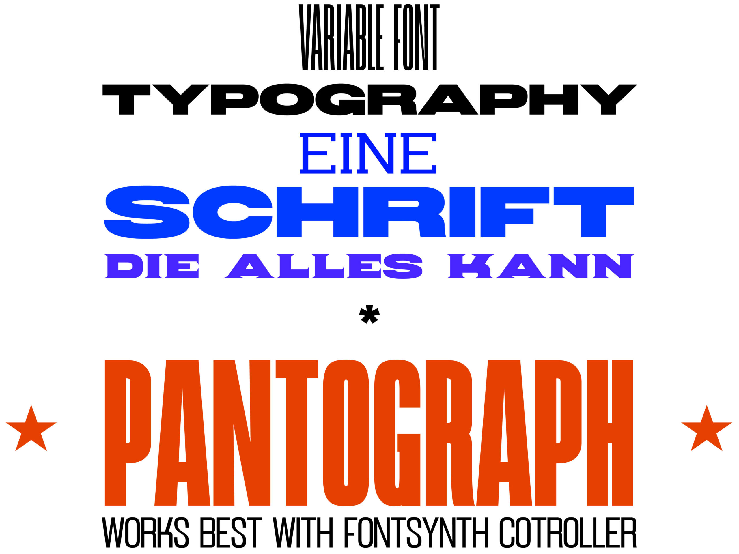
Pantograph variable font, Fontsynth poster editor
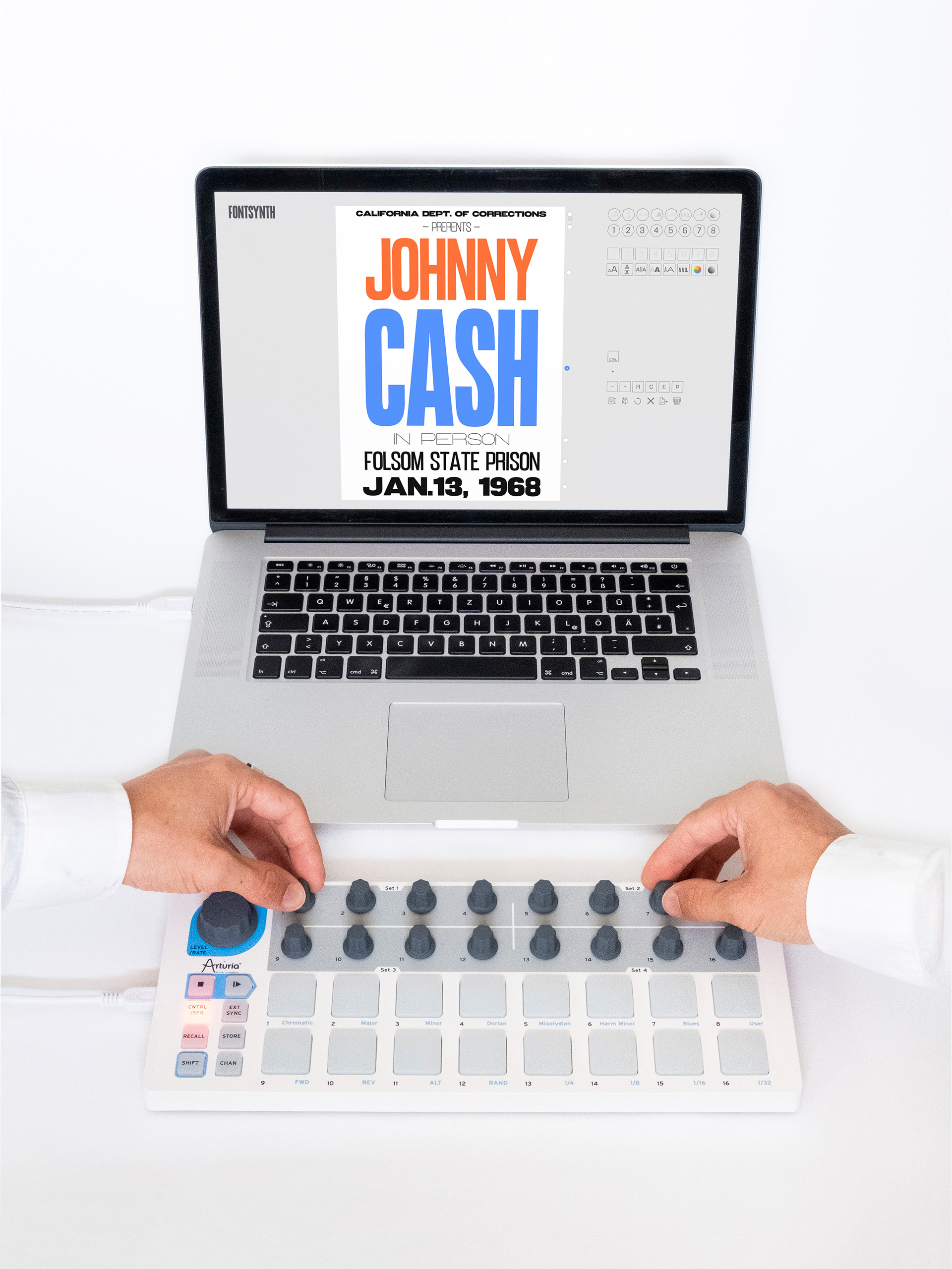
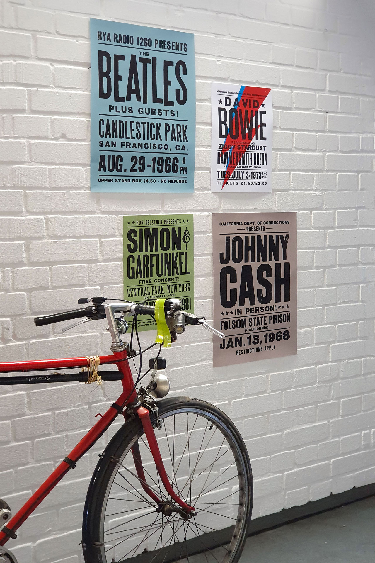
Handbills, advertisements, posters and printed matter from the late 18th and early 19th centuries have become icons in the history of graphic design. Ever since the use of hand-cut wooden letters and the handling of (white) space on an analogue printing press, a special aesthetic and great magic has lain over the golden age of display posters. Nowadays, very few of us will ever design and produce posters by hand at the printing table again after graduation, not to mention space issues or loss of materials. As you can see below, I am a big fan of this type of poster. Tired of using countless different fonts and styles of different font families to establish the good old look, I wanted a single variable font that would give me the smell of ink and solvents under my fingernails. I always wondered why there was no such thing, so I made one and got a diploma for it. The result is a wild variable font consisting of various typefaces.
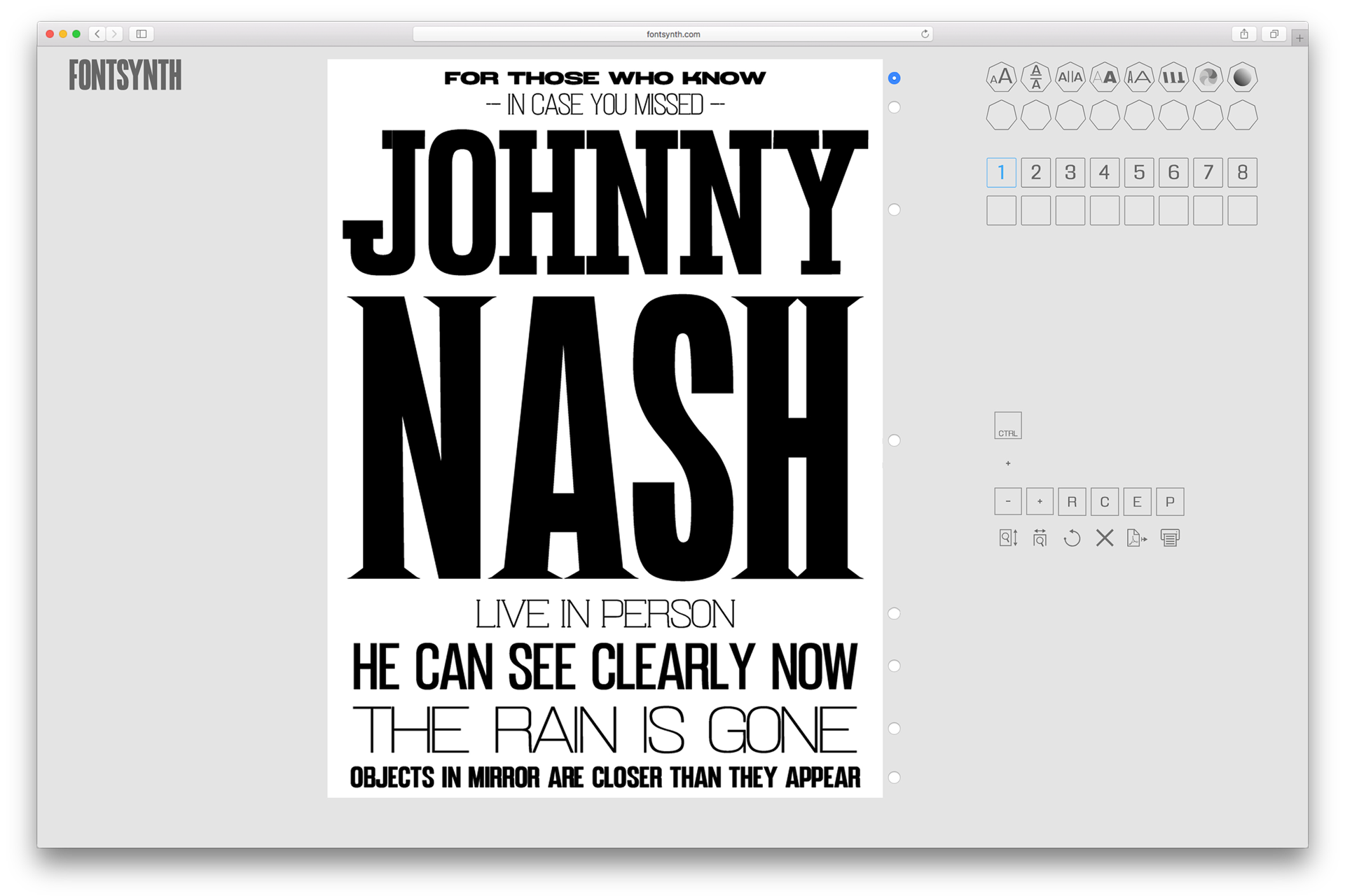
In the specially developed web-based poster editor, all parameters of the font, typesetting and layout are intuitively controlled by hand with a customised MIDI controller instead of getting lost with the cursor in the nested submenus. Just like a synthesiser shapes the sound of an oscillator — what you see is what you get.
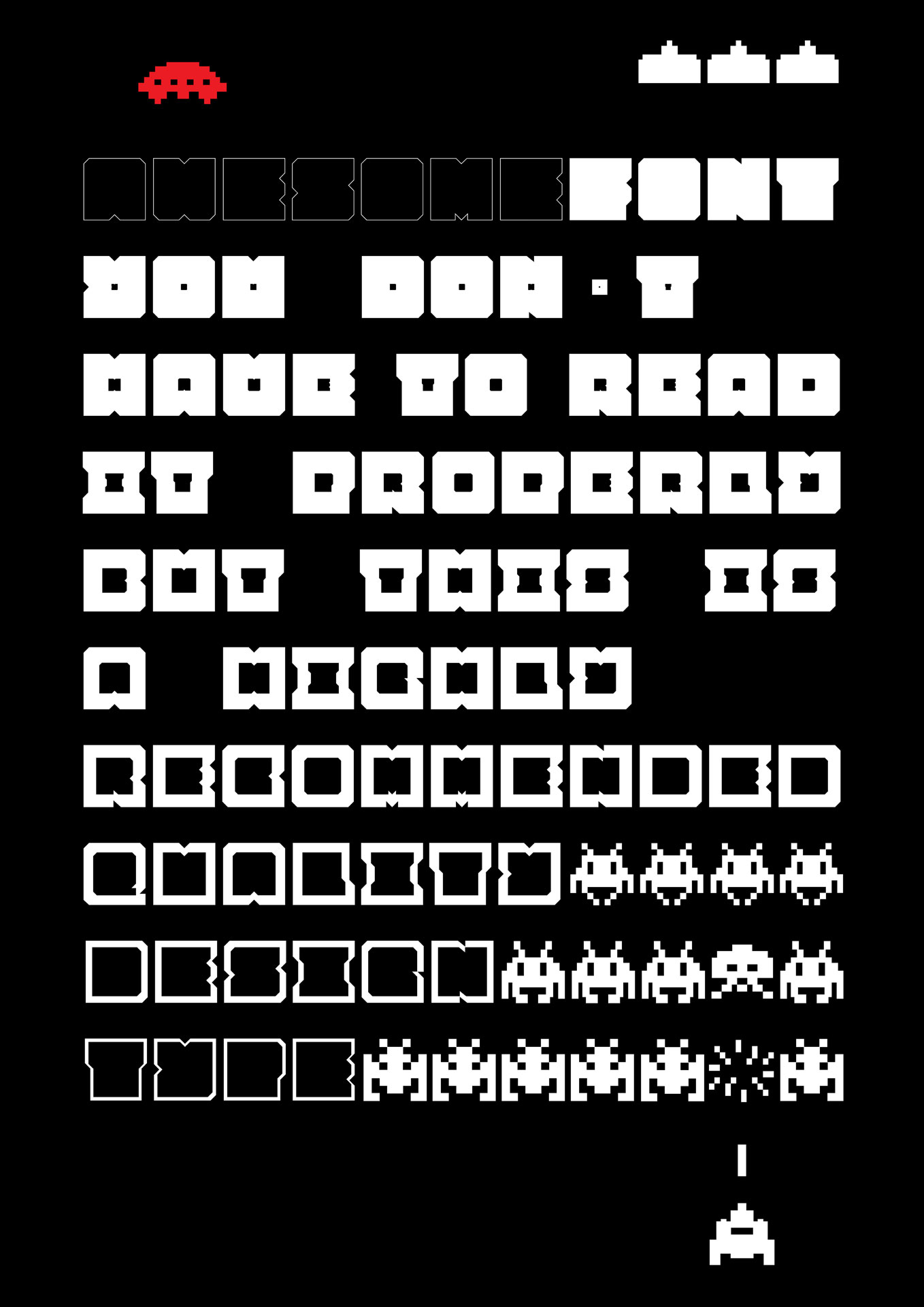
Type design
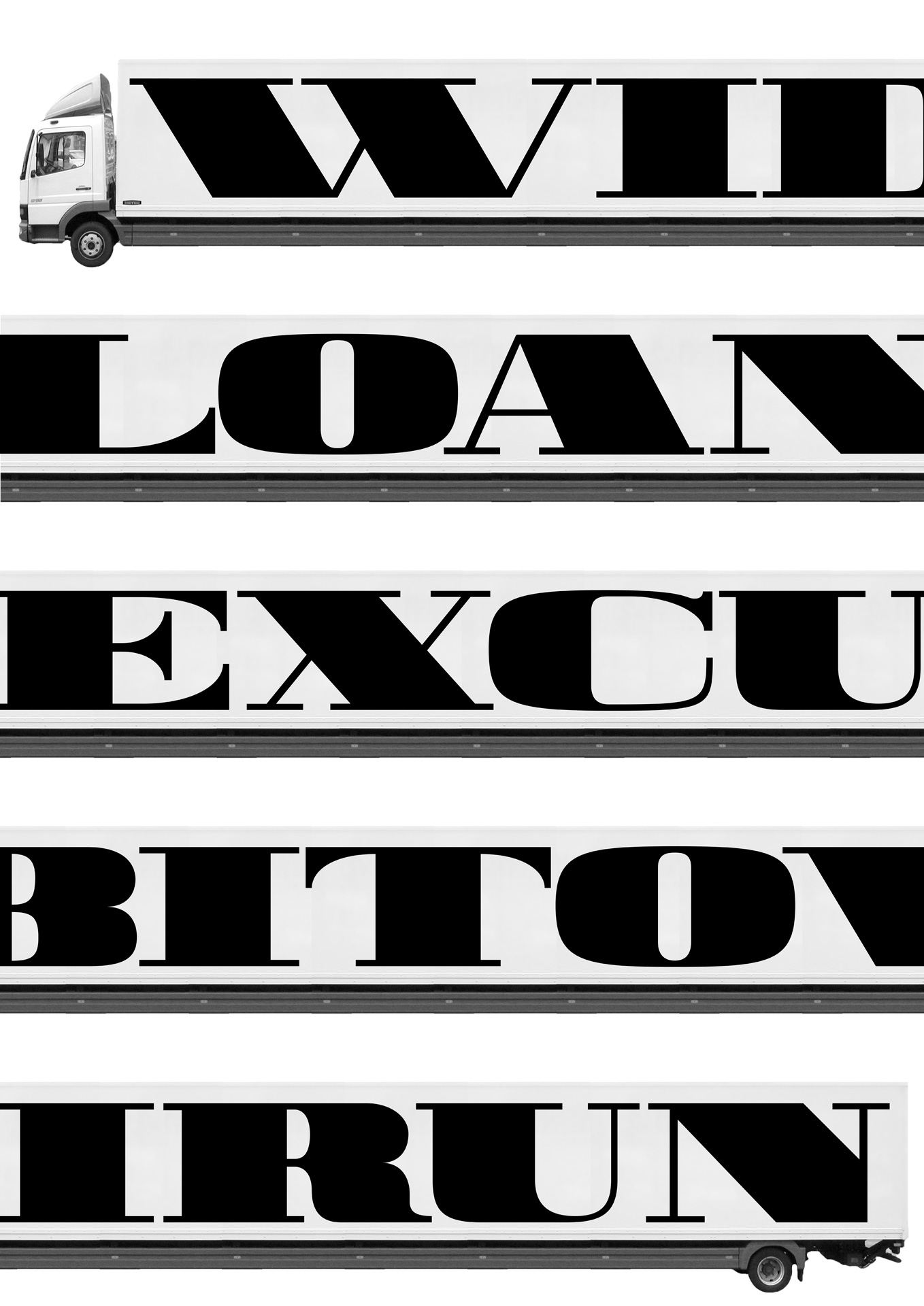
Inspired by a huge collection of original wood letters we have in our printshop at HBKsaar, I wanted to give back some love to some of the missing glyphs. First I made some proof prints on our old FAG printing press, then digitized the preserverd letter forms and analysed the characteristics. Then I was able to complete the missing glyphs and draw useable display fonts of it.
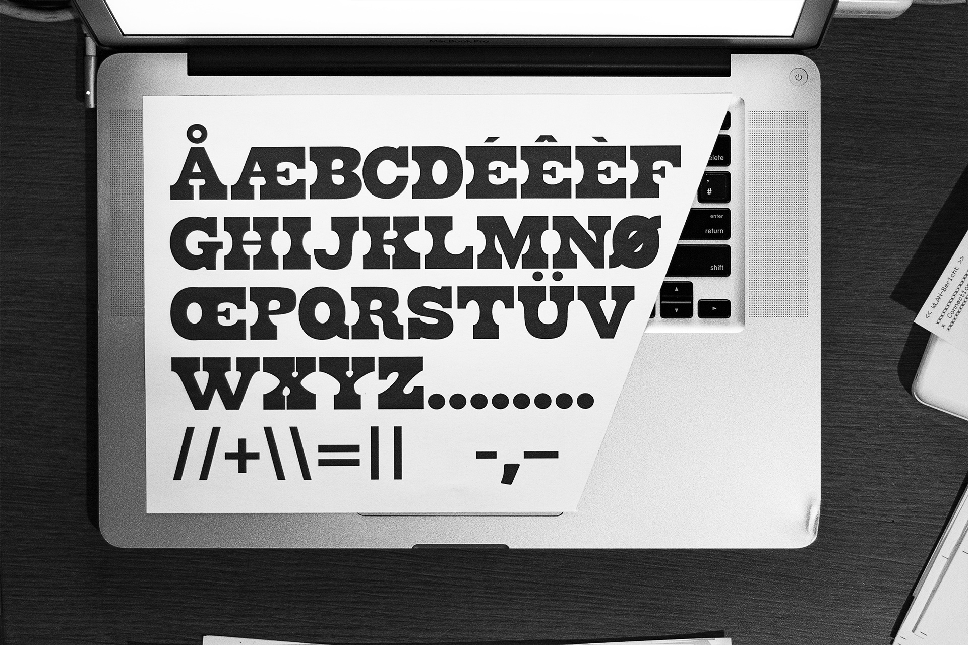
Another approach was to find out how little of a blank page in the font editor, a simple square, must be cut out to make it look like lettters – or rather make them legible? Also I started to explore the world of interpolating font styles. So it happened to be the following blocky yet dynamic family. Somehow between massive bricks and fragile outlines to complement each other.
Writings on the wall
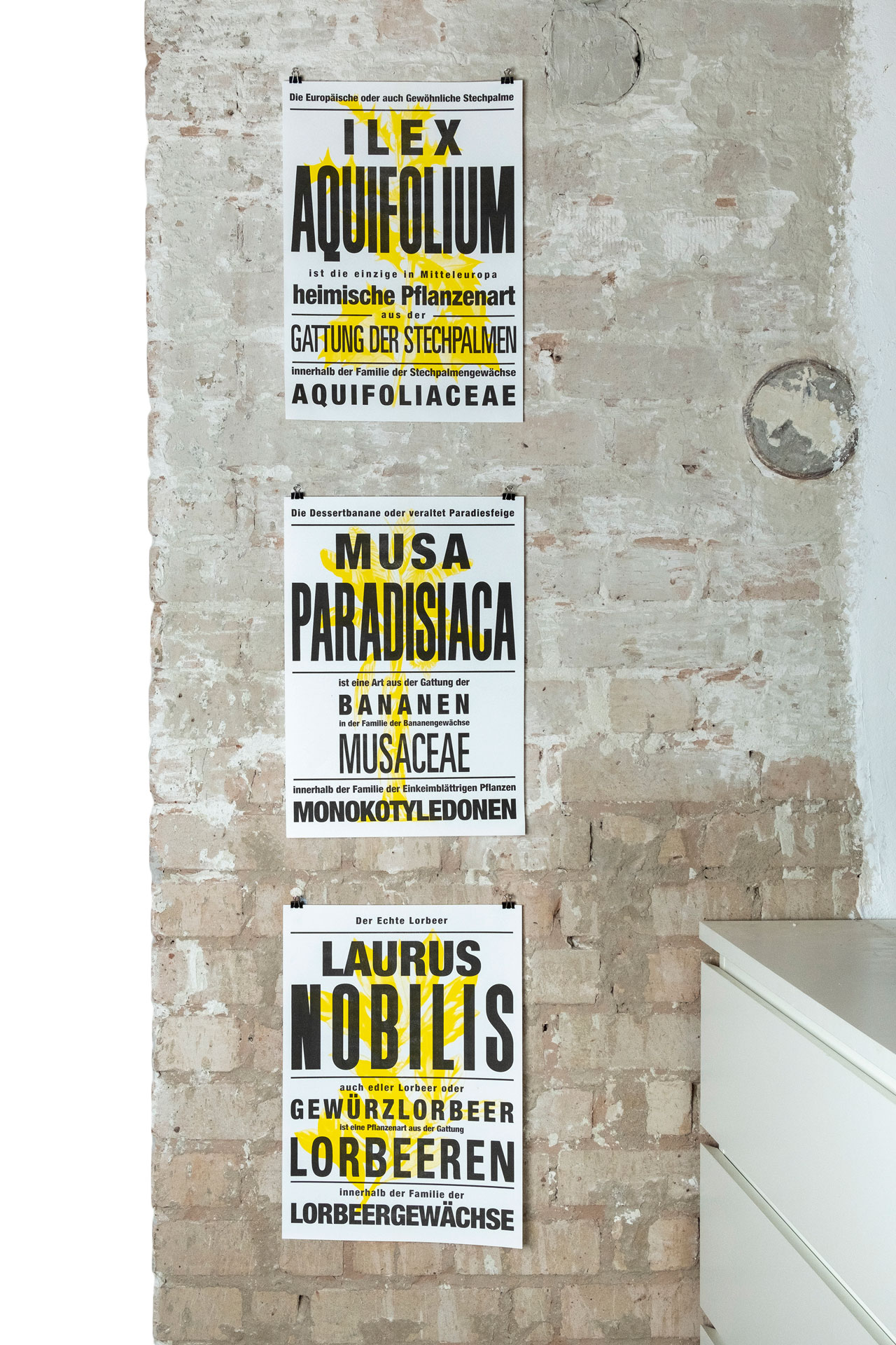
„Redundant botanical terminology“ — risography
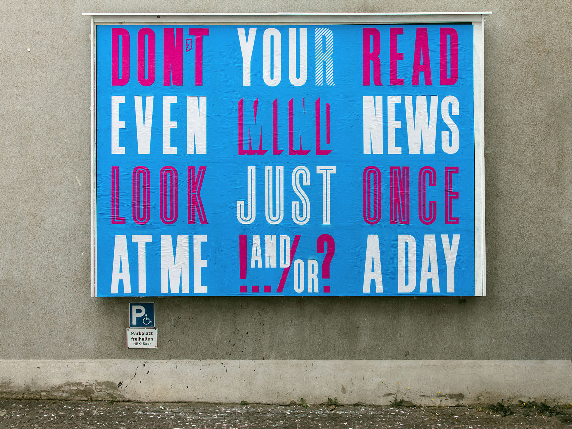
„Crosswords“ — billboard, university campus HBKsaar
more to come …
Branding
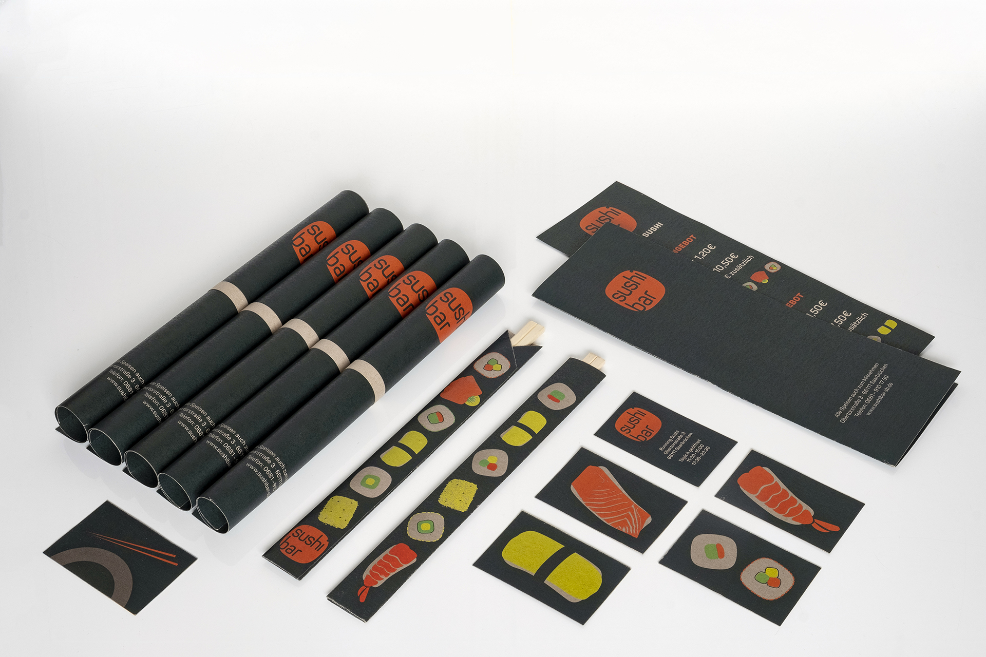
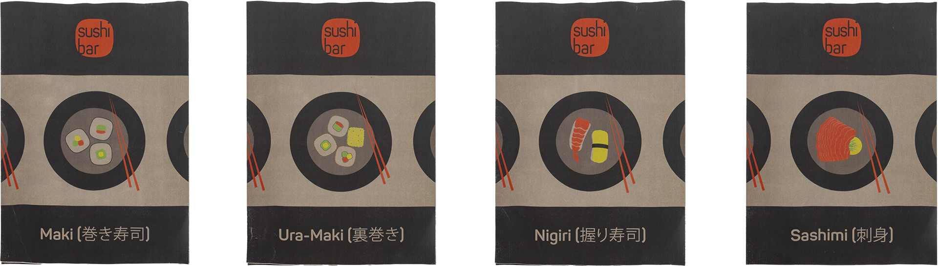
Logo and menu design for – obviously – a japanese specialty restaurant named after thetraditional dishes they serve. It’s not the fanciest name, nor the coolest spot in the town, so they had to at least get the most memorable menus. And cards. And chopstick covers. Intentionally no cheesy photos of foreign dishes, but simple illustrations for the different types of sushi.
Running Sushi advertising posters, no further explanation needed – just passing by and stays in mind.
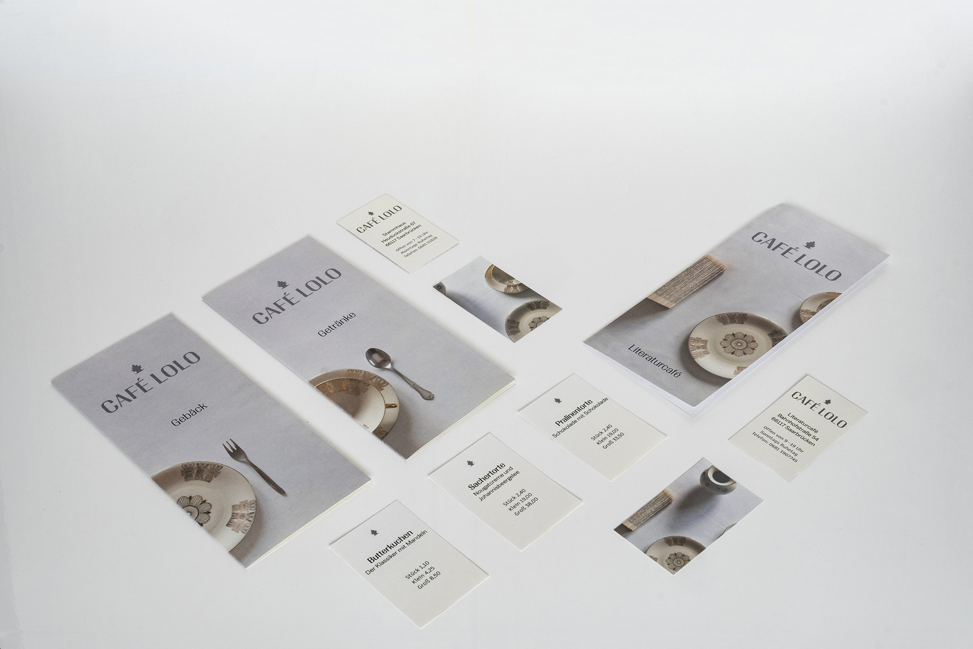
Near the university there is an old cafe run by a third-generation family. They are bakers, pastry chefs and restaurateurs, and they have a famous butter cake that they sell in large quantities and even ship all over the country — but they have no sense of design.
So the menu concept features a simple yet fine photographic representation of the original crockery, and points the way at first glance whether you want to order a coffee or a slice of cake or are sitting in the branch in a big bookshop.
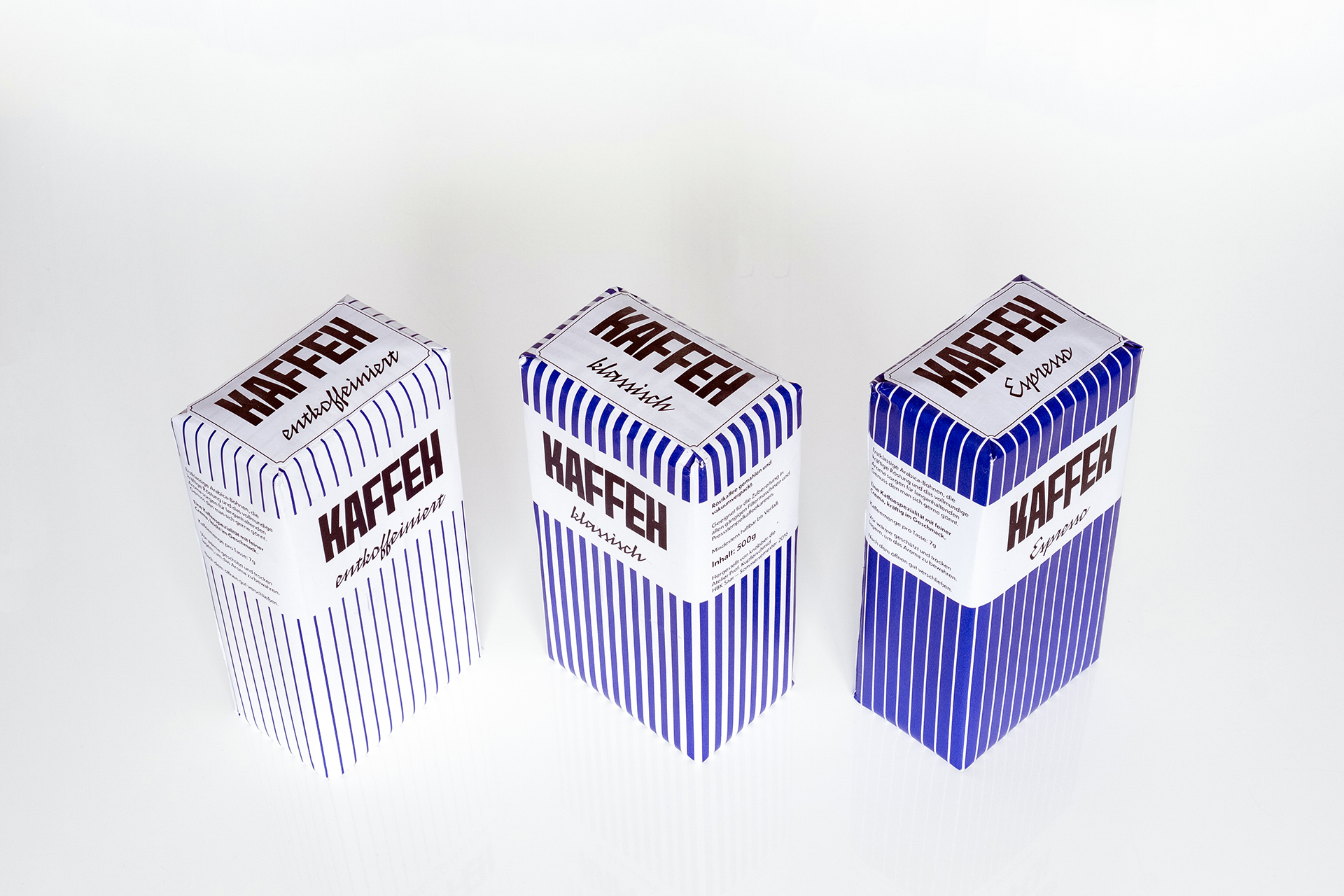
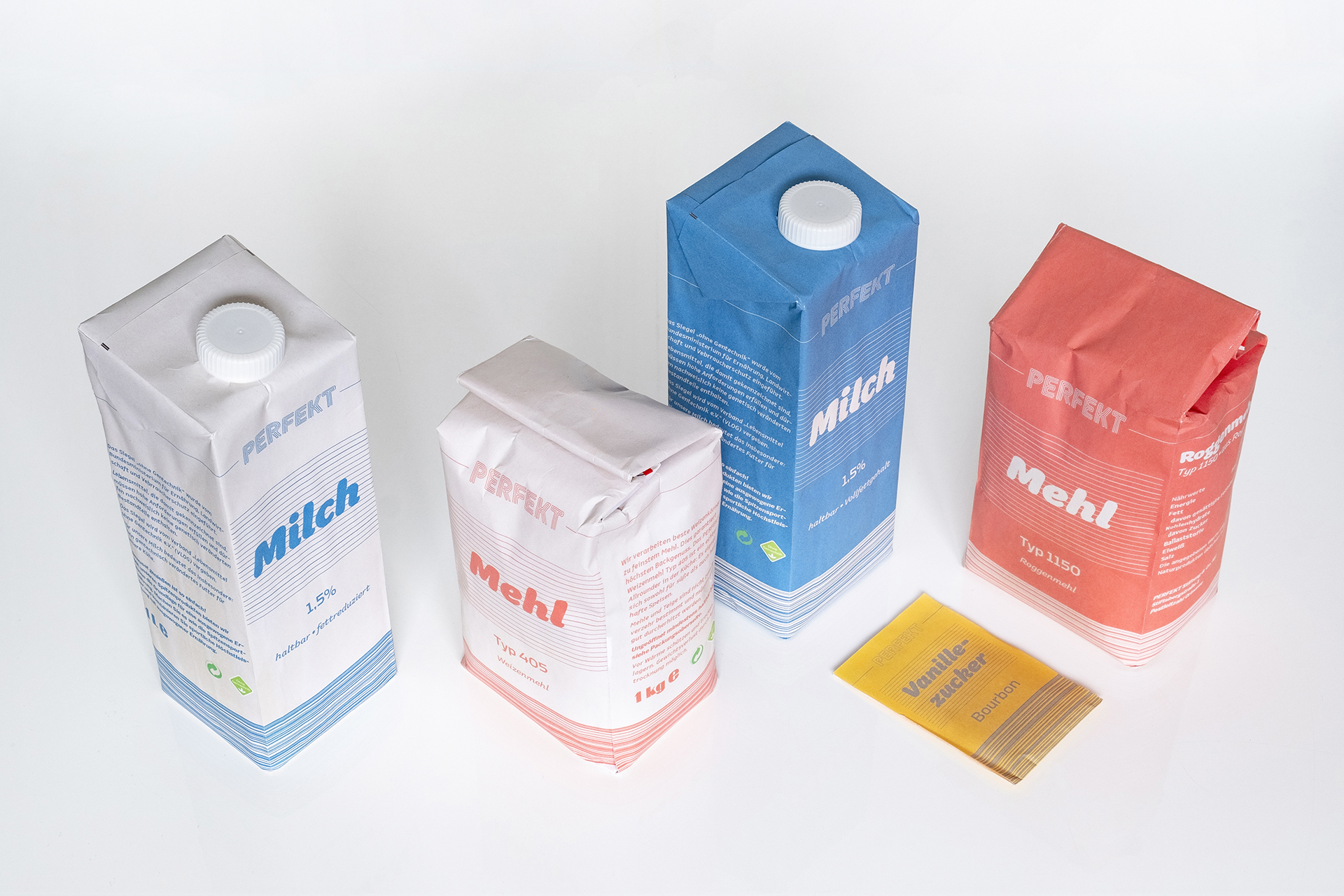
Packaging
What is it to be a product? How to stand out in an supermarket shelf? Attract attention and you will be loved! Except you’re very pricy, which will lead people to buy you for posing, you just have to show exactly from the first view what’s inside. A brand is a promise. On the other hand, if you have to wear the cheap shop label, you don’t have to wear a cheap design just to get noticed.